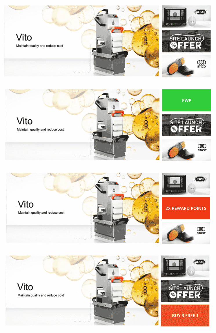
Our Kitchen Arena website is back with an all new, modern look. Huzzah!
1. More intuitive user experience

2. Multiple categories/products at a glance
Honestly, our old website wasn’t very good at this. There was no way to view the categories without clicking INTO it to get an idea of the products in said category. Now, instead of opening multiple tabs for a look at what’s inside each category, you just gotta scroll down on our homepage for a peek at the categories.
3. Mobile responsive
Urghhh. Don’t even mention how UN-mobile responsive our old site was. We are well aware of how inconvenient and annoying it was to browse the site on our mobile device, ESPECIALLY if we want to buy something.
Well, we say its time to start shopping!
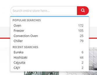
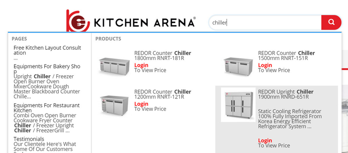
4. Advanced search functionality

Our search function isn’t as advanced as Google’s, obviously. But hey, its a MAJOR improvement over the old one. Don’t believe us? Try it out yourself.

5. Secure online payment

You'd most probably notice the padlock icon in the URL bar and that our web address now begins with https. Not sure what that means? Well, with SSL, your payment details would be encrypted and you don't have to worry about security when you're buying from us. So secure, kan?


